
SeeLess Solutions / Multi-Channel Brand Strategy / Case Study
Turning invisible technology into a visible brand advantage.
Built one brand system that stays flawless
from print spec sheet to mobile social banner.
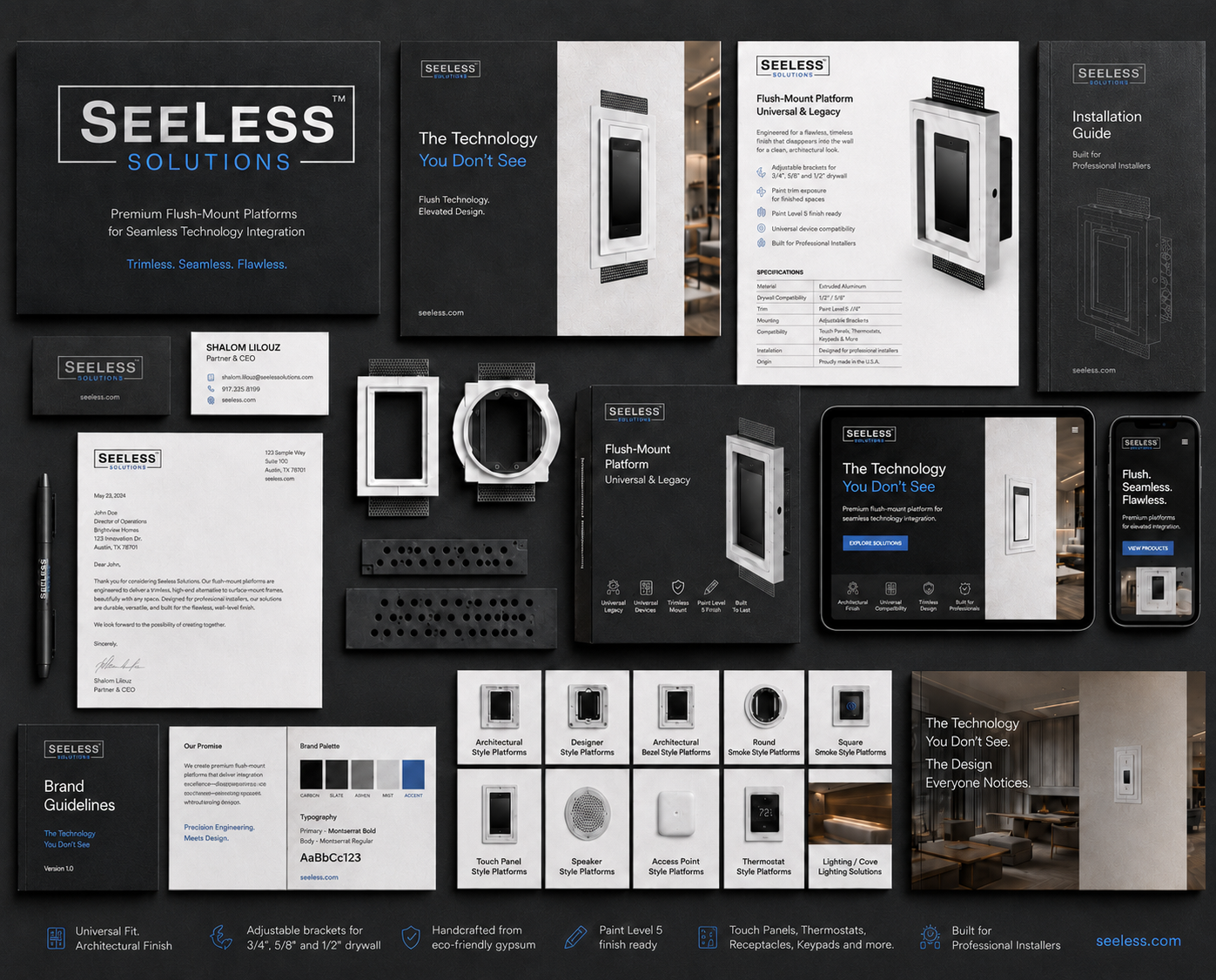
SeeLess Solutions needed a brand system that could turn its highly technical product line into a clear, premium architectural story. Built around the promise “The Technology You Don’t See,” the result is a coherent, multi-channel brand identity system that simplifies the message, elevates the product experience, and remains consistent across print, packaging, web, and trade channels.
Strategic idea: make the brand feel as precise and coherent as the product itself—quiet, engineered, premium, and production-ready.
MY ROLE:
Brand Strategist · System Designer · AI Prompt Engineer
MY TOOL STACK:

Figma
Illustrator

Photoshop

InDesign

Midjourney
THE CHALLENGE
Flush-mount platforms are functional, technical, and detail-driven. The brand system had to make the product value obvious: less visual clutter, cleaner walls, better architectural integration, and a more elevated finish.
THE STRATEGY
We reframed the SeeLess branding strategy around a premium promise: “The Technology You Don’t See.” This positioning turns invisibility into the core benefit—technology that performs without interrupting the design.
Target user
Architects and interior designers, builders, AV integrators, and installers — each needing different collateral and supportive materials but in a different format and level of technical depth to achieve consistent architectural integration.
The AI + Human System
Brand tools for every touchpoint
1 · Discovery phase
2 · The AI acceleration
"Used AI layout generation to spin the core system into channel variants — spec sheet, packaging, social — for rapid review."
"Used Midjourney to generate architectural mood boards that aligned stakeholders on the 'invisible technology' tone in days, not weeks."
3 · The human refinement
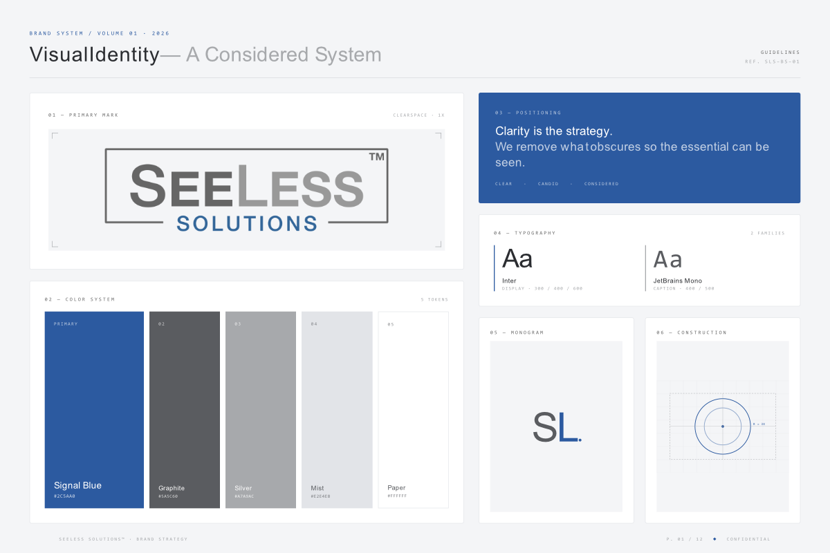
I codified the system that makes consistency repeatable: Signal Blue as the clarity cue, a graphite/silver/mist/paper neutral set for restraint, monospaced type for spec credibility, and product-tile rules for fast category navigation. AI explored; the system rules made every channel unmistakably SeeLess.
The Visual Wow Strategy
Message by medium
Website
Lead with clarity.
Sales collateral
Make specs simple.
Trade / Installer
Build confidence.
Social / Email
The before-and-after.
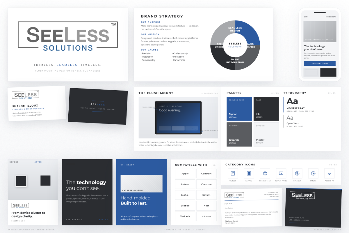
Brand system: logo architecture, signal blue palette, typography, positioning language, monogram, and construction logic built for consistency across print, digital, packaging, and trade channels.
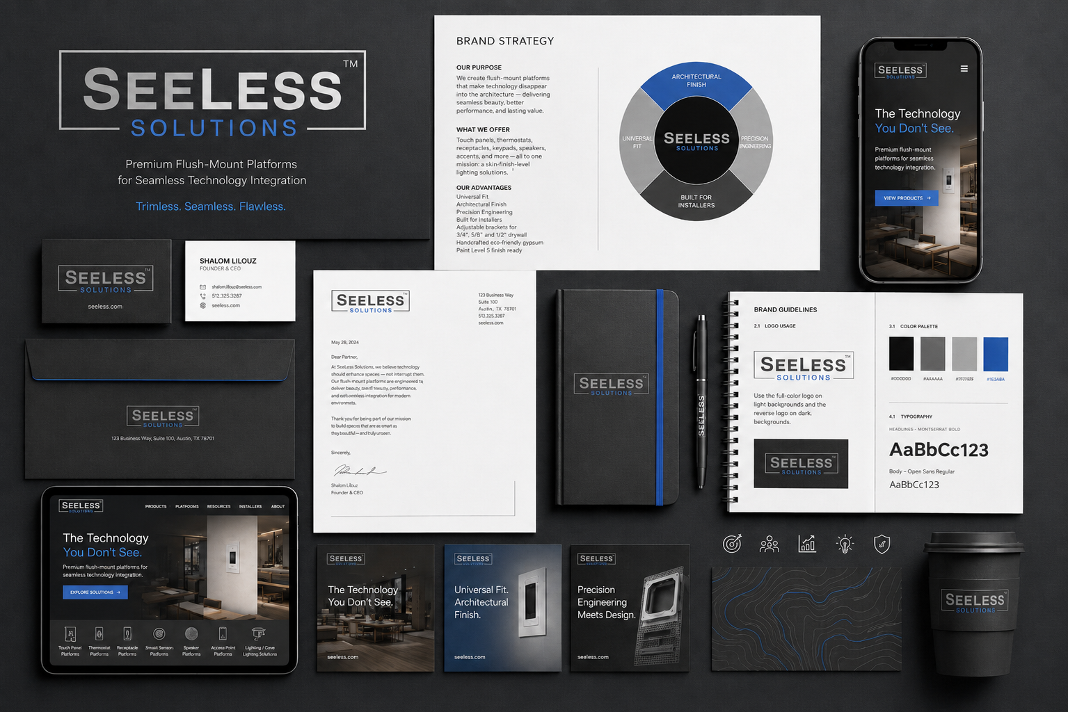
Multi-channel rollout: product cards, website UI, business collateral, category icons, spec/sales sheets, and brand messaging created for interior designers, integrators, installers, and trade partners.
Recommended Messaging Pillars & Impact
01
Trimless. Seamless. Flawless
02
Flush technology. Elevated design.
03
Built for professional installers.
8
channels, one system
−70%
asset production time
100%
spec-accurate & on-brand
These pillars create a repeatable voice across the website, pitch decks, trade show displays, catalogs, installation guides, product pages, paid ads, social content, and dealer communications.
Vision-Driven Brand Strategy
A refined multi-channel system that translates SeeLess’ technical precision into a premium architectural story—positioning the brand as the invisible framework that connects value, visual elegance & design-forward technology.
Seeless Solutions™ — Brand Strategy Case Study