
SeeLess Solutions / Multi-Channel Brand Strategy / Case Study
andTurning a technical lighting library into a clearer, brighter brand experience.
Turned a complex lighting library into a clear path from inspiration to specification.
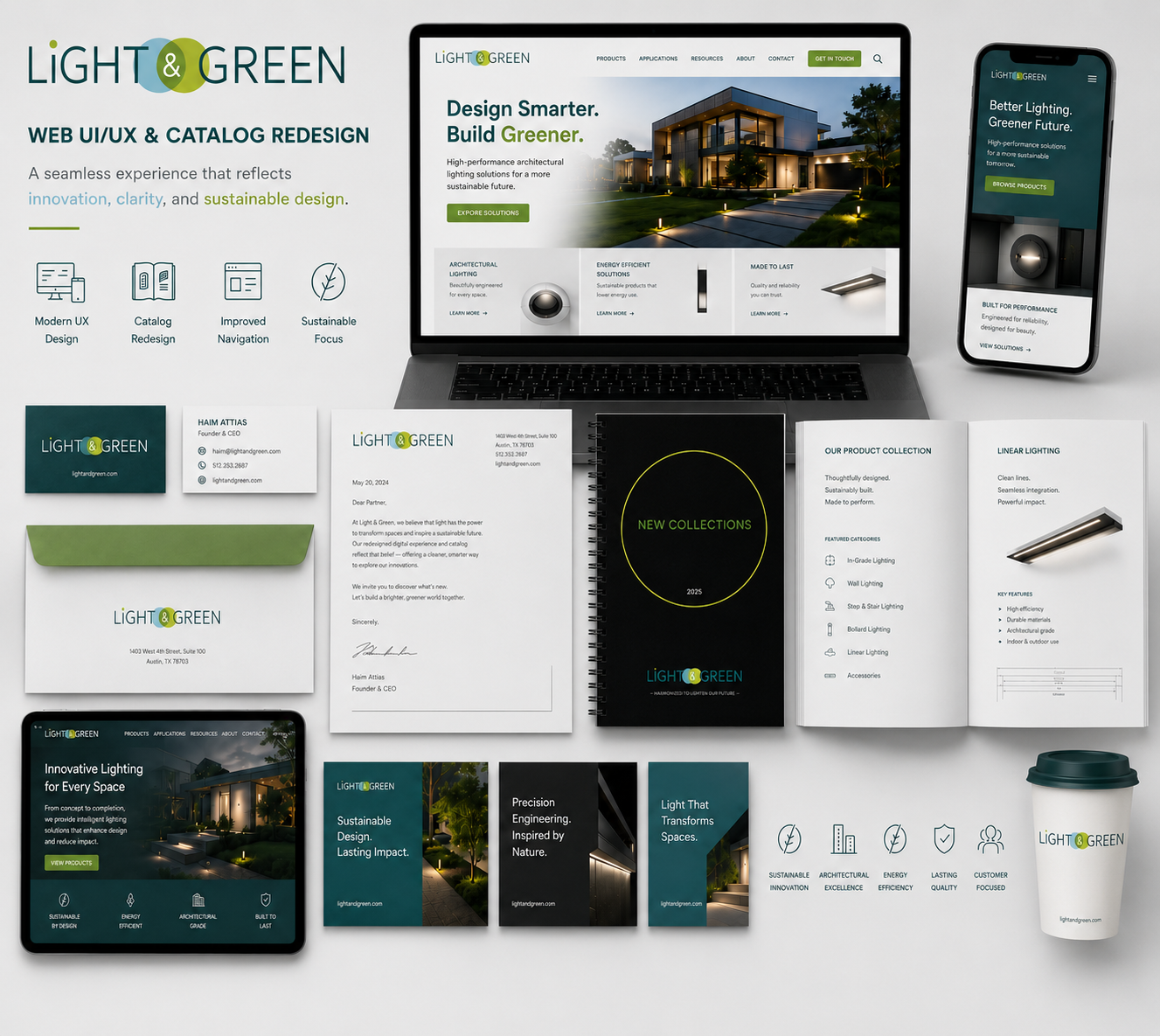
Light & Green had a distinctive product story: handcrafted gypsum and concrete architectural fixtures designed to disappear into the space. The redesign opportunity was to make that promise easier to understand, easier to explore, and more compelling across both the website and the product catalog so architects, designers, reps, and installers can discover products faster and understand specifications sooner.
Creative idea: let the digital interface & print catalog behave like the product—clean, trimless, minimal, and quietly precise.
MY ROLE:
UX/UI Designer · Photo & Iconography · Catalog Art Direction
MY TOOL STACK:

Illustrator

Corel Draw

InDesign

Photoshop

Photography

Divi
THE CHALLENGE
The original experience contained valuable product content, but navigation, category discovery, imagery, and technical information needed a more cohesive hierarchy. The catalog also required stronger photography, custom iconography, and a system that could organize a broad product family without feeling dense.
THE USER EXPERIENCE
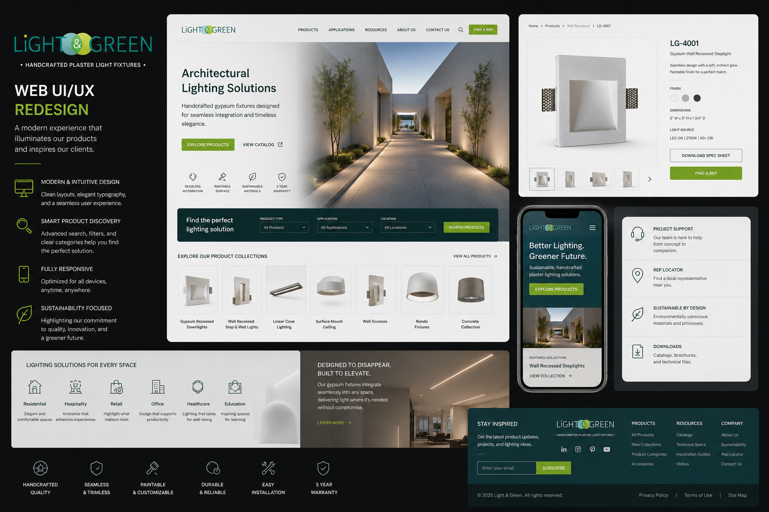
A cleaner system balancing architectural inspiration with utility. Large-project imagery creates aspiration; product cards, filters, downloadable specs, install & wiring sheets, rep-location tools, and concise benefit icons support confident decision-making for architects, interior designers, sales representatives, and installers.
THE APPROACH
- Unify the visual language across digital and print.
- Create clearer product categories and search paths.
- Elevate product photography and technical presentation.
- Develop custom icons for ratings, materials & installation.
- Design responsive interfaces for desktop, tablet, and mobile.
Methodology & Approach
Responsive Web & mobile + catalog
The redesign process · complexity → clarity
Existing Content Audit
Info & Theme Architecture
Icon & Design System
Page & Catalog Templates
Specs & Collaterals
Responsive Rollout
The crafting process
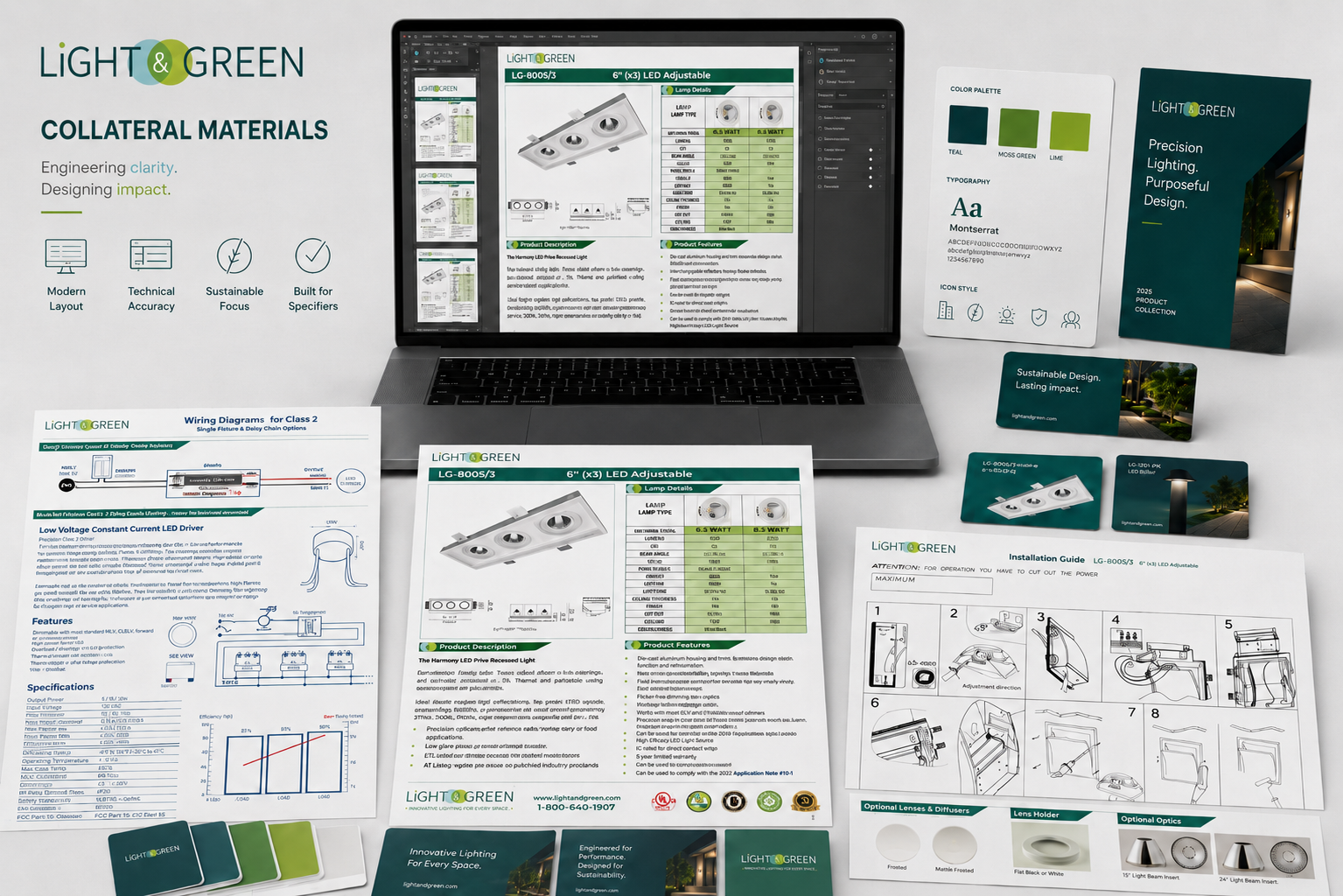
Used Adobe Illustrator and InDesign for new iconography & supporting materials. Used Divi Builder for layout web page design & mobile responsiveness control/testing.
"Used Photoshop & digital photography for 200+ product images. Used Corel Draw to generate final catalog layout mechanicals as requested from printing partner.
crafting the Experience
I made the interface behave like the product — clean, trimless, quietly precise — with vivid Light & Green accents guiding attention to key actions. Every custom icon, technical diagram, and template was hand-tuned so a large collection reads as calm and confident, never dense. That editorial judgment is what turns organization into trust.
Experience Strategy
Purpose by touchpoint
Homepage
Lead with the space.
Product discovery
Reduce search friction.
Product detail
Make confidence visible.
Catalog
Turn complexity into clarity.
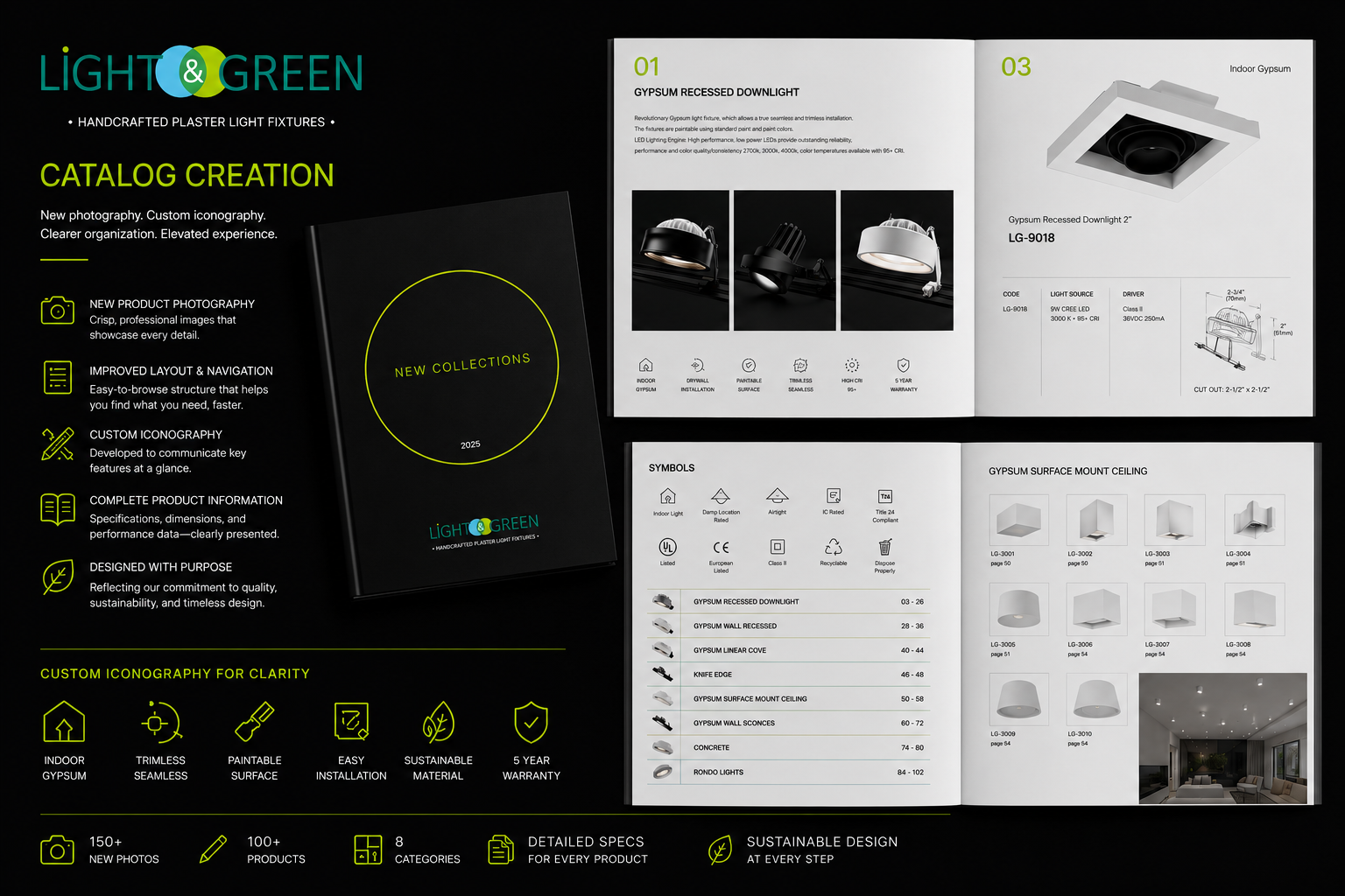
Catalog creation: professional product photography, custom iconography, improved navigation, technical diagrams, product indexes, category systems, and specification-led page templates designed for fast reference.
Recommended Messaging Pillars
01
Seamless navigation for every audience.
02
Product photography that reveals precision.
03
Built for professional installers.
2 → 1
Web + print unified into one system.
+N
Custom icons for ratings, materials & installs.
3 vp
Responsive desktop · tablet · mobile
Redesign outcome
A premium and refined usable brand experience that connects sustainable materials, handcrafted engineering, and architectural beauty—helping Light & Green move customers from inspiration to specification with less friction and greater confidence.
Light & Green — Web UI/UX & Catalog